Types of Charts
Charts are prices, plotted over one specific timeframe. Vertical axes represent the price of one given instrument, while the horizontal axis represents the time horizon.
The most common types of charts used by technical analysts are:
Line chart
Bar chart
Candlestick chart
Line Chart
The line chart consists of dots connected by a line. These dots usually record the closing prices of currencies on one determined timeframe.
[Chart 1]
The line charts are commonly used by traders whose main focus is to study only closing prices.
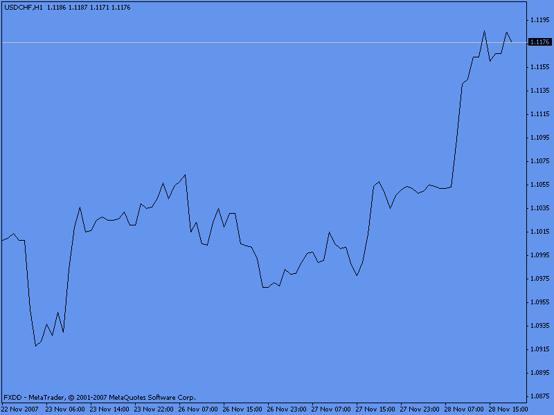
Bar Chart
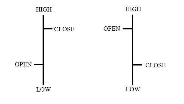
The bar chart gives us more information regarding price at any given moment. It records the high, low, open and close price of one security during any given period.
[Image 1]
The high and the low are represented by the top (high) and the bottom (low) of the vertical line. The open price is represented by the short horizontal line on the left, while the close price is represented by the short horizontal line on the right.
[Chart 2]
On the chart above, every bar represents 30 minutes of price action. The top and bottom of each bar represent the highest and the lowest price of every period (30 minutes). The horizontal lines represent the open and the close of each 30 minutes bar
Candlestick Charts
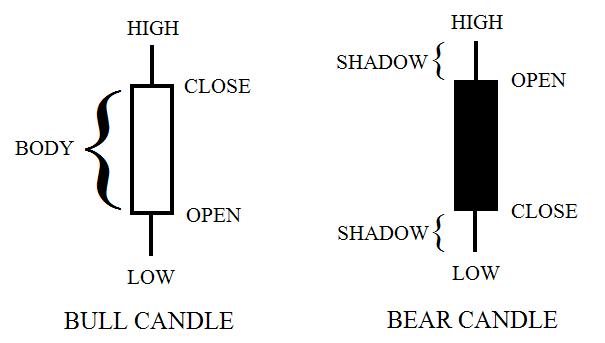
Candlestick charts are very similar to the bar charts, they also record the open, close, high and low price of every period. The only difference is that candlesticks have a body on each bar.
[Image 2]
Every “white” (or hollow) candlestick indicates that the price closed higher than where it opened. Thus the open price is the bottom of the body (not the whole candlestick), and the close price is the top of the body. In contrast, every black candlestick indicates that the price closed lower than where it opened. Thus the open price is the top of the body and the close price is at the bottom of the body.
The wicks above and below the body of the candlestick are called “shadows” or “wicks”, they represent the highest (upper wick) and the lowest (lower wick) price printed for each period.
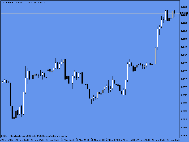
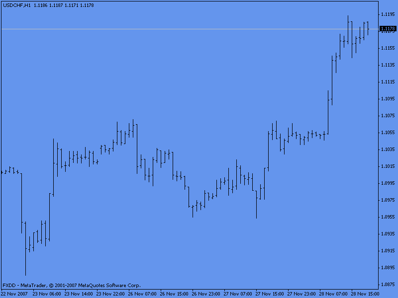
[Chart 3]
Candlestick charting has become very popular for traders. The main reason for this is because it is easier to read and study the relationship of prices (and investor’s psychology) on this type of charting.
Later in our courses we will see more about candlesticks, we will learn what each one of them represent as well as other patterns that could help us make a better trading decision. We will get to that!